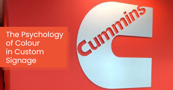
What does a business sign mean to you? Upon examining all the successful brands worldwide, people easily recognize their signage from a mile away. When creating your business’s signage in Toronto, the custom signs you put up publicly and online are crucial to getting people to trust your brand and become loyal customers.
So where do you start? Choosing your brand’s colour scheme isn’t like picking your favourite colour. It requires brainstorming, research, and testing to see which colours represent your business.
Let’s take a closer look at how the psychology of colours plays an essential role in influencing what attracts them to certain brands. We’ll also discuss why the right colours are imperative for your business.
What Is Colour Psychology?
Colour psychology is about the emotional and psychological connections produced by viewing colours.
Furthermore, colour psychology looks at the relationships between different colours, such as black, white, and red, that affect your mood and behaviour.
Why Are Colours Important in Your Signage?
The moment you step outside and go for a walk or drive in your car, you’ll see signs everywhere. From street signs to the signs of businesses, you can’t deny that colourful signs are everywhere.
Here are three of the most important reasons why the colour of your business signage is vital to get customers and how to choose the right colours for your brand.
Signage Improves Visibility
Consider the example of driving in your car and seeing multiple signs simultaneously. Which signage stands out to you? That’s the main reason why custom signs in Toronto are essential.
It makes your business stand out and improves visibility. When people walk or drive by your company and remember your signage, it indicates that your sign is visible.
Signage Influences People
Choosing the right colours for your business is a critical process because it speaks volumes to people who see it. It’s also an expression of what your brand represents, so it’s essential to have the right combination of colours when using signs. Otherwise, if they’re a slight mismatch, it can misrepresent your brand.
Here are a few examples of mismatched signs that you want to avoid in your brand’s signage:
- Faded signs look dated and unclear making them hard for people to read.
- Big block letters in neon colours may be too overwhelming, depending on your business, and can scare people away.
- Small fonts against a black or dark background are unreadable and won’t get any attention. It will be hard to read.
Remember that choosing mismatched colours in your signage is a big failure for your company and won’t do much to influence customers to do business with you.
Signage Leaves a Lasting Impression
Let’s be honest; custom signs in Toronto are everywhere. With so many businesses competing for customers’ attention, every sign you see has been tested with focus groups and revised numerous times before it goes to print.
Signage is tested with focus groups before it goes live because they want to know which colours resonate with the subjects and what impressions they get from taking one look.
With signs, you should choose colours that represent the nature of your business and will leave a lasting impression on people.
Three Ways to Choose Brand Colours
Colours ignite emotions in people’s subconscious minds, affecting their moods and feelings. That’s why the colours you choose for your business’s signage can influence people to become loyal customers.
With so many colours on the spectrum, which ones should you choose for your brand? Here’s some help on what you should discover before deciding on your brand colours.
1. Brainstorm With Adjectives
It might seem like a basic start but spend about 15 minutes writing down several adjectives and synonyms that describe your business. For instance, if your company sells organic and clean products, “healthy” and “natural” are perfect adjectives.
Once you’ve compiled about ten adjectives, you can match them up with some colours that describe those adjectives.
2. Know Your Target Audience
Think of your business’s target audience age group. If they’re adults from 18-45 years old, then choose brand colours that are fun and youthful, like yellow and green.
Pick versatile colours like red, white, and navy blue if you’re selling to a more general demographic.
3. Check Your Competition
Looking at your competitors’ brand colours in their signage is a great way to gauge what you’re up against. If you’re willing to take risks, creating custom signs in Toronto that are the opposite of your competition can work for you.
However, suppose you want to produce a feeling of familiarity and tell your demographic that you’re similar to your competitors. In that case, using the same colour scheme with your images and company logo is a good idea.
Choose Colours Based on Your Brand’s Personality
Now let’s discuss the most commonly used colours for creating your business’s custom signs in Toronto and the psychology behind each colour.
Black
When you use black as a backdrop, the message or information used on black signage creates a feeling of mystery. When you see a black cat walking by or someone wearing a black dress, it usually transmits a sense of formality or allure. If you want people to feel like you’re a professional brand with a hint of mystery, go for black.
On the other hand, the colour black can also evoke feelings of sadness and isolation. The trick with using black in your signage is to combine it with a light colour like white or silver. For instance, the carmaker Mercedez-Benz uses black as its backdrop and silver as its logo.
Their image conveys a message of mysterious luxury. So, if your message sells a lavish lifestyle, selecting black as your signage’s colour is a great choice.
Green
Green is very popular for companies promoting plant-based, sustainable, and environmentally-friendly products. Suppose your business isn’t related to the environment or nature.
In that case, choosing green in your company’s signage is still a head-turner. Green stands out and promotes innovation and creativity. For instance, the Starbucks logo is in green and is recognized internationally.
Blue
Blue is a prevalent colour that successful brands use to promote feelings of reliability, trust, loyalty, and tranquillity. What’s more, when blue matches white, it attracts the most loyal customer base.
For example, Facebook and PayPal all use blue and white in their signage, and they have millions of loyal users.
Choosing blue and white for your custom signs in Toronto is a smart move if you want to promote your business as a trusted brand where your customers can rely on excellent customer service, outstanding services, and trusted products.
Red
Red represents intense energy and boldness. Overall, when people see red signs, it can ignite feelings of passion and excitement.
Coca-Cola and Netflix are powerhouse companies people trust and feel excited about when they consume their products and services.
Moreover, pharmacies and emergency non-profit organizations like Red Cross and Shoppers Drug Mart use red signage. Red is your ideal brand colour if your business deals with health-related matters or pharmaceuticals.
Contact Us for Custom Signs in Toronto
Suppose you have questions about selecting your brand’s colours and combining them into custom signs in Toronto. In that case, we specialize in brand logo design, retail signage, and digital and print design.
For more information or a quote, call us at 866-591-6938 or contact us here.


Leave A Comment