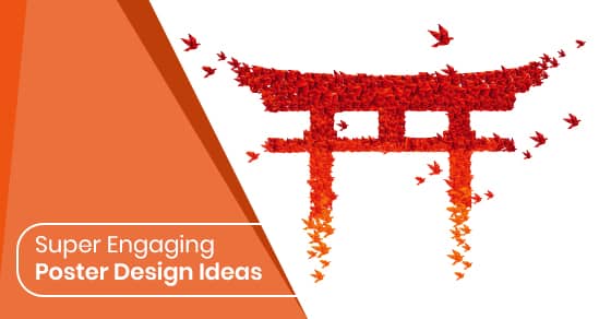
Iconic posters become a memorable form of pop art that lives from generation to generation. From the Keep Calm and Carry On Posters that were resurrected to create everything from wall art to t-shirts and the recognizable movie posters from the silver screen to the unforgettable concert posters for bands like The Beatles and the unmistakable army recruitment finger-pointing figure of Uncle Sam, posters evoke not just memories, but command a presence that lasts beyond their own era. Here are some of the secrets top poster artists use to find themselves in the historical annals of poster stardom.
Create a Mood with Colour
Colour is the first thing people notice on a poster, even if that colour scheme is black and white. It attracts the eye and sets the stage for your design. You can use your logo for inspiration, but also consider what you are selling and all the factors that affect it. For a business, you can use your specialty to inspire you, or if you offer many products and services, you can focus more on the brand itself. You can use colour to create any mood whether its subtle elegance, loud excitement, or a soothing feeling.
Use Interesting Fonts
Fonts are designed to provide you with an element of design that helps bring your words to life. Much like colour can convey a mood, fonts can create a tone for your poster. Your choices include serifs, sans serifs, and handwritten options. You can then work with versions in bold, italic, light, and in between styles that allow you to highlight or accent words or lines as required.
You can work with two fonts, but going beyond that can become very busy. Don’t feel stuck with keeping all your words going from left to right. Use angles or even put them diagonally on the page. This forces people to change their view to get a better look.
Use Visual Hierarchy
Visual hierarchy allows you to prioritize the points in your message. You have to allow people to get the gist of what you’re conveying in as little as eight seconds, so the headline is the most important element. By ranking your message in order of importance, you will make sure the main point is caught by most people at a glance.
With a lot of copy, you become more limited in the visuals you can use, so it will become necessary to depend on your type. For fewer words, you can be more creative and choose a compelling image to engage people. Each part of your message can be divided into chunks that can become smaller as they make their way down the page. However, it’s also necessary to make a call to actions, or contact info larger at the bottom so people don’t miss the website or phone number.
Lay It Out
Having a well thought out layout will help make sure you are putting everything together logically. Hierarchy prioritizes while layout organizes. They work together to create harmony on the page. A simple trick when working with many different elements is to use layering to add interest and depth. An image on top of a shape, or words over an image, add an additional design element that helps draw people in. Symmetry is also important to the layout, but that doesn’t mean everything has to be centred. Use your image as a guide to decide what makes the most sense for balance, and if there isn’t an image, experiment with positioning your type in different alignments.
Don’t Be Afraid of White Space
White space can often be a designer’s best friend, as it allows you to bring full focus to the details that count. It also works well with simplistic messages where you want the message to really pop. Using white to help create a more prominent focal point is a classic design approach that can work for all types of poster messages. It allows your image or type to breathe and makes it easier for people to focus.
Keep It Simple
When in doubt, the KISS approach is always best. By keeping your design as simple as possible, you make it easier for people to get the message. Remember, Keep Calm and Carry On posters consisted of simple words and a crown — simple but iconic decades later.
Focal Point
When using photography, don’t get caught up in the belief you have to show the whole thing. Sometimes, a really tight crop creates intrigue and drama more so than showing the entire image. Likewise, using an image of something very far away can work in the same manner. Closely cropped images, as well as long shots, both tend to force people to look more closely, which of course is a good thing.
Shapes for Interest
Shapes can be used to block off an important aspect of your message or to train people where to look next. It is a versatile design element that can also add interest to an otherwise boring page. When combined with the right colours, it can prove to be quite effective.
Illustrations
If you are an excellent artist, consider creating an original illustration for your poster. Iconic illustrations in poster art include President Obama’s HOPE posters, the art deco drawings of Erte, and the Absinthe ads from 1896 painted by Henri Privat-Livemont. And let’s not forget Banksy!
Evoke Emotion
Much like the single word HOPE moved a nation, the right word or image can spark emotions that work in your favour. Emotions create memorable moments, sometimes good, sometimes bad. Again, depending on your messaging, you can conjure up everything from sadness and joy to anger and reverence.
Consider a Template
If you want to help create a recognizable brand, using a template works well. For example, the black shadow of a figure wearing white headphones became the unmistakable look for iPods. Choose the layout and apply your new message/image for each new poster.
Know Your Audience
Consider who you are targeting to ensure you don’t miss the mark. Age, sex, and even cultural elements help draw the attention of the right people. You want to consider their interests, buying habits, trends, and culture to make sure you hit the right notes.
Contrast and Graphics
Contrast is always a good thing as it helps you draw attention to the most important aspects of your poster. Colour contrasts would partner opposites such as black and white or yellow and deep blue. You can also use dramatic bold fonts for headlines and a finer font for the rest of the text or a bold image with lighter tones and colours. You can add interesting techniques in Photoshop to alter your photographs to add contrast to better set the mood and tone.
Using these tips will help you create impressive, impactful, and memorable posters.
We can help with the final step with outstanding printing services. To learn more or get a quote contact us here.