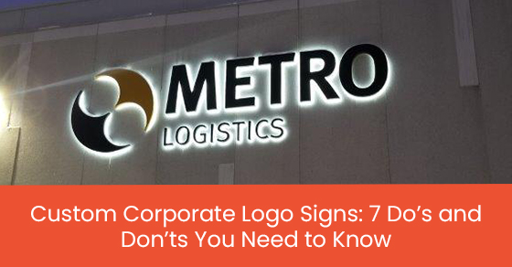
In business, advertising is everything.
When you think of advertising, television commercials, newspaper ads, social media posts, and direct mail brochures will likely spring to mind. However, your company’s signage also falls into this category.
Signs are the face of your business. Not only do they help existing customers find your location, but they’re also an essential part of discovery for new clients. A strategically placed and thoughtfully designed sign attracts business and represents your brand effectively.
When designing and ordering signage for your corporation, following the seven do’s and don’ts described in this list is essential.
1. DO Invest in a High-Quality Sign
There are so many reasons to invest in high-quality signage.
Firstly, signs constructed of quality, durable materials last longer and look better throughout their lifetime. They can withstand the elements and severe weather conditions of Toronto, reducing the need for costly repairs and replacements. Consequently, long-lasting signs provide significant cost savings in the long run.
Additionally, a high-quality sign is a better representative of your business. A thoughtfully designed sign works properly, is constructed of superior materials and looks professional. It’s an effective, cost-effective marketing tool that promotes your business and attracts new clients.
A high-quality sign also enhances the professionalism of your business. Your company is more likely to be perceived as trustworthy, instilling potential clients with confidence in your services.
2. DON’T Cut Corners
Although signage can be costly, it’s important to remember that signs are an investment in your business’s future. Cutting corners and compromising quality for price is a poor long-term strategy. Low-quality signs will not last as long. Their colours fade quickly, the lights flicker, and the sign can chip and degrade. Soon, the sign will need to be repaired or replaced.
A cheap, broken, and worn-down sign sends the wrong message to potential clients. It shows that you refused to invest in your business and put effort into your brand image. Ultimately, this harms your business.
3. DO Stay on Brand
As a business, all marketing materials must stay true to your brand. All signage should be representative of your brand and match your brand image.
You should use the same logo that is present on your website, products, social media platforms, business cards, and other marketing channels. You should also include your name in the same typeface and use the same brand colours.
Maintaining a consistent brand image is crucial for building recognizability among ongoing and prospective clients.
4. DON’T Blend In
Signs are meant to be eye-catching. They shouldn’t blend in with their surroundings or be indistinguishable from the signs of neighbouring businesses.
You should always be mindful of what your competitors are doing, including their choices in signage. If the surrounding signs are unlit, then lighting your sign is an effective way to stand out. The same can be said for style, size, and colours.
5. DO Ensure that Your Sign Is Visible
If no one can see your sign, then there’s no point in having a sign. Consequently, it is paramount to consider visibility when placing your corporate signage. Your sign should be seen easily from the sidewalk, street, and parking lot. Furthermore, it should not be blocked by trees, telephone poles, or other business signs.
It’s also essential to place your sign at the right height for passing drivers. If your sign is too high or too low, drivers will not be able to see it as they pass by.
A driver’s gaze stays at windshield level, about 30 degrees below or above the horizon line. People rarely lean forward to look up at the sky, so signs that are too high are usually missed.
As a rule of thumb, signs along roadways should be placed at the same height as a regular road sign. Drivers are used to receiving information at that height, which increases the chances of your sign being noticed and read.
6. DON’T Include Too Much Information
When it comes to corporate signage, readability is crucial. It’s a bad idea to show viewers more information than they can take in quickly. You can visually overwhelm audiences by including too much text or using unreadable fonts and an overly complex design. As a rule of thumb, less is more.
Although you should include your business name alongside your logo, you don’t need your business’s address, phone number, email, and website on your sign. All this information makes the sign look crowded and messy. Quickly passing drivers will be unable to read all that information, much less remember it.
If someone knows your business’s name, they can find everything they need to know with a quick online search.
7. DO Prioritize Safe Installation
Attempting to DIY your sign installation can be highly hazardous. It’s best to leave the installation to the professionals. After all, they have the required experience and the proper equipment, such as scaffolding, ladders, platforms, and protective gear.
A knowledgeable signage installation company will place your sign properly with secure mounting. They can also handle any electrical work safely and efficiently. For your safety, you should never attempt to do your electrical work.
A poorly mounted sign is risky for everyone. It’s easy to injure yourself during a botched installation. Additionally, a poorly affixed sign could fall, putting pedestrians in danger.
New Style Signs for Custom Corporate Signage in Toronto
Effective and attractive signage attracts new customers, directs existing clients to your location, builds brand awareness, and showcases professionalism.
Consequently, investing in a high-quality custom sign for your organization is vital. New Style Signs can help.
We design and manufacture eye-catching and long-lasting corporate signage for companies in Toronto.
To learn more about custom corporate signage in Toronto, call New Style Signs at 866-591-6938 or contact us here.


Leave A Comment