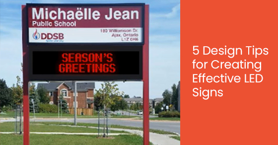
LED signs are a highly effective way of attracting attention and delivering your message. At least, they can be with the right design. Design is essential when it comes to creating effective LED signage.
When you adhere to design principles, your signage becomes your brand’s advocate. It communicates your professionalism while also conveying your message and information. Poor design, on the other hand, fails to say anything positive about your organization.
To help you create an effective LED sign, here are our top 5 design tips:
1. Know the technical limitations
Have you heard the phrase, “The medium is the message?” This principle applies throughout the media world, yet is particularly relevant regarding LED signage. Let us explain.
Ultimately, there are technical limitations to digital signage and what you can accomplish. It determines what kind of content you should and shouldn’t display. Therefore, to create effective marketing, you must understand how it will look when displayed on your sign. You must consider resolution, pixel pitch, minimum viewing distance, and the environment.
Plus, every digital display has slightly different characteristics. It means that works with one screen won’t necessarily work for another.
Part of good design is understanding the limitations of your medium. A fully digital LED display is the perfect opportunity to communicate a colourful, animated, engaging message…but you must be mindful of the technical details.
Generally, we don’t recommend automatic scaling of images. Instead, adjust your content to have the exact pixel resolution of the LED display.
2. Prioritize readability
If your audience can’t read your message (or is utterly indecipherable), then it’s useless. It may sound obvious. However, many companies fumble the readability ball. They fail to consider the technical limitations of the sign, get caught up in the flashiness of digital messaging, or make other basic design errors.
Easy-to-read designs significantly impact audiences. Consequently, readability is one of the most essential design factors to consider. Several factors influence an LED sign’s readability:
- Colour: Bright and neon colours can be uncomfortable to look at—particularly if they contrast each other. You want colours that enhance visibility (especially from a distance) without being an eyesore.
- Contrast: Some colour combinations are easier to read than others. White text on a black background (or vice versa) is high contrast and easy to read. Other colour combinations, like two neon colours, can be challenging for your eyes with low readability.
- Speed: Animation is a great way to capture the attention of audiences. However, moving text can hinder your sign’s readability if it is moving too fast. The average adult can read 3–5 words per second. Any faster than that, and your message becomes an illegible blur.
- Spacing: There must be sufficient space between words and images for audiences to understand your message. Negative space is an important design element, particularly where readability is concerned.
- Fonts: The typeface on your digital LED sign also impacts readability. It’s paramount to choose a font that works with the pixel-based nature of your LED sign. Bigger block fonts work well, and cursive fonts do not.
3. High-quality images or graphics
Images and graphics are a great way to make your sign engaging and unique to your brand. However, they need to be high quality.
What does high quality mean? You must correctly size your images to fit your LED sign perfectly without stretching or pixelating. The colours should also look attractive rather than slightly wrong or off-putting (think of a person’s face displaying bright red skin instead of skin colour). Graphics should be in the proper format, ensuring they show as intended.
Your LED sign must exude professionalism. You want to appear competent in all your marketing efforts- and signs are a form of marketing. Low-quality or incorrectly formatted signs may cause customers to chuckle as they drive by, yet don’t instill confidence in your brand.
4. Avoid clutter
The design should be clear and concise–not cluttered. Any design, signage or other that is too busy and overloaded with elements becomes ineffective instantly. It’s crucial not to overwhelm people visually.
Busy designs look chaotic, and they’re off-putting to audiences. It’s especially damaging with signage because you have a limited timeframe to make an impression. Sometimes, you only have a few seconds to communicate your message. There isn’t time for a reader to try to decipher your sign or extract your message from an overcomplicated design.
Simplicity is always more effective.
Instead of overloading your sign with multiple design elements, remember this: less is more. Don’t clutter your design with too much text or too many images. Only display the most vital information. Limit your message to three lines of text, with five words in each line. Ensure the font size is large enough to read at a distance but preserve negative space.
5. Add engaging features
One key advantage of digital LED signs is that they are incredibly versatile. Many come with a range of engaging features, which you can use to grab the attention of audiences and communicate your message with the utmost efficiency.
For example, full-colour graphics are an exciting feature of digital signs. The bold colours demand attention, helping you stand out from the competition. However, don’t forget basic design principles: limit your colours. Using too many colours will make your sign appear busy and chaotic. Instead, stick to one or two vibrant colours.
Animation is another fantastic option. You also don’t need a lot of movement to catch a viewer’s attention. Even subtle movement is enough to be eye-catching. If you’re opting for a lot of animation and substantial movements, ensure your message is still readable.
Choose New Style Signs for LED Signs in Toronto
New Style Signs creates custom LED signs in Toronto for businesses, organizations, schools, and government agencies. Our signs go beyond lighting up the name of your business. They let audiences know that you are a professional and reputable business. We are a highly experienced signage company that has been operating in Toronto for more than 50 years.
To learn more about LED signs in Toronto, call New Style Signs at 866-591-6938 or contact us here.


Leave A Comment