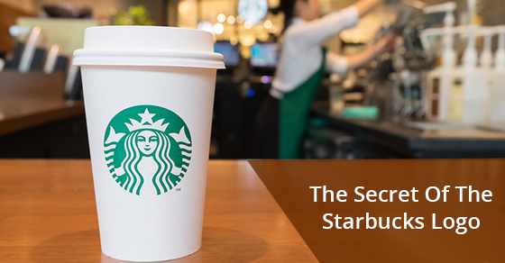
By this point, Starbucks is now such a widespread and iconic brand that the logo is something most people can simply call to their minds at will. The Starbucks siren with the rippling hair, the green and white, the crown, the tail coming up the back. This is what a good logo does, it sticks in our minds and becomes a part of our psyches. It also helps that there is a Starbucks on nearly every corner of every city all over the world. Here’s an interesting fact that most people don’t know! The Starbucks logo has a secret that only the the keenest observers are likely to notice. It’s not something which immediately stands out or is even that intuitive, but it’s there. Below is a breakdown of the Starbucks logo secret.
During the design of the Logo, the design team, upon completion of the first draft, understood that something was missing from the siren, they just didn’t know what yet. The colour and proportions made sense, the use of shape and contrast was what the company was looking for, yet something was still amiss: The siren lacked character.
The company’s global creative director and her team ultimately decided that what the Starbucks siren lacked was humanity. She was too perfect. She needed a flaw, some sort of imperfection to make her more human and relatable. This was an important step in making the Starbucks logo one of the most successful brands in business history. If the siren was going to look human and relatable, she couldn’t be perfectly symmetrical. Now that you know this, if you look hard, you can definitely see the secret.
Look closely. Notice the nose and the eyes. The flaw is highly subtle (and that’s the point), but the nose dips slightly lower (by only a few pixels) on the right hand side than it does on the left. The Siren has a crooked nose. Just like most human faces are not perfectly symmetrical, neither is the Starbucks siren.
The point of giving you insight into the Starbucks logo secret it to drive home a point: Introduce some subtlety into your logo design. The human eye is incredibly complex while also being incredibly sensitive. It is capable of picking up very slight changes in pattern, colour, texture and is attuned to notice subtlety. While not everyone’s eye is capable of picking up or noticing the same kinds or levels of subtlety (though that is certainly something you can train your eye to do), even at a subconscious level, the brain knows when something is amiss and will pick up on it.
This stimulation, even if it is just a small amount, is a fundamental part of attracting and holding someone’s attention and the secret of the Starbucks logo does that almost perfectly.
For more information on custom signs for your business, contact New Style Signs at 866-591-6938. We provide everything you need to create a quality signs that will provide a lasting impression. From concept to design, manufacturing, and installation.


Leave A Comment