When it comes to designing a sign, there are two key ways to communicate your message: image and lettering. While an image requires familiarity with the brand for viewers to decipher the meaning, lettering communicates the message directly. The design process prioritizes simplicity to ensure that the message is legible. With lettering, you should consider the following factors.
-
Size
The right letter size depends on how far you would like the sign to be visible from. You should decide the location of the sign before creating the sign, to ensure that the letters are sized accordingly. The minimum recommended letter height at a 100-foot viewing distance is 4-inches. Using a similar proportion for different letter heights can help you estimate the maximum distance from which your sign will be visible.
-
Spacing
To get the spacing right, you should first measure the area that the lettering will cover, and then use a template. A template helps to prevent cases of uneven spacing between letters, and prevents running out of space in which to fit your words.
-
Colour
The colours for your sign background and lettering should have good contrast, so the message stands out and is legible. For instance, black over white is easy to read. For something more interesting, you may use white letters with a black outline against most any colour background without affecting legibility.
-
Font
Your choice of font will probably be the first thing a viewer notices, so you should ensure that it is easy to read. Choosing a clear but common font, like sans-serif, could make your sign look generic, but it may be the best choice for a sign that is placed at a considerable distance from the viewers. As beautiful as script fonts may be, they are not legible from far away.
Get Creative
Sign creation is a creative process, so don’t be afraid to experiment, especially with your choice of fonts. Try mixing different types of fonts for the brand name and tagline. For instance, you can use sans-serif for the most important information, to make it more prominent, and serif for the supplementary information.
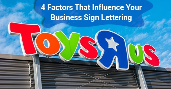
You can also experiment with atypical or unique fonts, provided they match your brand and message. For instance, businesses that sell children’s products and services, such as toy stores, children’s boutiques, and daycares may opt for bright and cartoony signage.
Before you start designing your sign, think about your target audience. How much time do they have to read your sign? Are they driving past your sign or standing in line as they stare at it? Choose the right lettering for your location and audience.


Leave A Comment