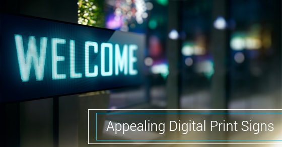
Many business owners and department heads blindly follow the buzz, stats, and descriptions of digital print signs and how they can be included in their annual advertising budget or their next big marketing campaign. But even with these marketing materials, it is not that easy to generate a response from your audience. If you cannot grab the attention of your audience, it will be difficult to get them to read or even notice your advert.
Here are a few ideas on how to approach this segment of the advertising industry and optimise your return on investment by making your digital print sign more appealing:
- Establish a focal point
It is not practical to emphasise every part of your design. As such, you should decide what is most important in your print. You need something like an image or graphic, promotion or headline, or other text/lettering to attract readers and draw them in. Your focal point should have the most visual weight and it should immediately stand out at first glance. There are a number of elements that you can play around with to create a focal point, such as the size, shape, position, colour, direction, or texture. For instance, a big descriptive headline will make your sign impossible to miss. - Simplicity and visual flow
The objective is to give viewers a place to start looking. To achieve this, your design should be organised in such a way that the eyes of the viewer move from the focal point to the rest of the layout with ease. Designers call this hierarchy, whereby the design elements are sized, spaced, and arranged in such a way that viewers know where to look first, and how to proceed through the rest of the design. - Contrast
Contrasting colours command attention: consider red or blue on white. Contrast is both functional and appealing, in that it can emphasise specific elements or areas of your design, making them stand out as more crucial. Contrast involves more than just colour opposites. For instance, it can involve scale, typography, shape, and other elements. However, too much contrast can be jarring, so take care. - Harmonious colour scheme
Colours play a deep, subconscious role – psychological, emotional, cultural – and largely influence how your print design is perceived. The colours used can give your sign a definite mood – serious, playful (yellow, coral, or aqua), or sophisticated (gold and black). Ensure that the colour scheme creates a mood that coincides with the purpose of your sign so you don’t send mixed signals.
Finally, ensure that your images and final file formats are high quality so that you can print high-quality, extra-large signs that create the impression of an important message. Instead of using standard print sizes, choose large sizes that create curiosity.


Leave A Comment